Context
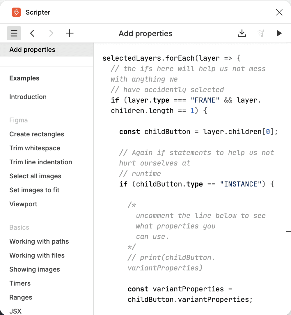
When I joined Taka, the design and research function was still in its infancy. My first challenge was addressing a bloated and broken design system. It had been created by someone still learning Figma, and had grown so unwieldy it had to be split into three files just to keep Figma from crashing. Naturally, this made collaboration nearly impossible and created hesitation across the team—particularly from PMs—who’d seen previous design system “fixes” derail roadmaps.
Meanwhile, the platform’s UX was full of anti-patterns: dropdowns that updated information off-screen, inconsistent components, and a front-end architecture that didn’t support reusability. To make matters worse, devs were hardcoding UI elements and tokens, meaning even small changes couldn’t be applied globally without manual updates.
It was clear we needed a reset—but a pragmatic one that wouldn’t slow delivery or burn out an already skeptical team.
Before:
After:

My Role
My goal was twofold:
Build a system the team would actually want to use.
Do it in a way that wouldn’t slow down product development or require a full design overhaul.
To get buy-in, I focused on quick wins. I met with engineers, product managers, and marketers to understand their pain points and where design could move the needle for the business. One key insight: rebuilding everything from scratch wouldn’t be realistic, nor necessary.
To bring everyone along, I created a diagram that showed how design decisions had a snowball effect across the business. It helped illustrate how investing in the design system would benefit everyone, making it easier to align cross-functionally and advocate for contributions beyond just the design team.

Approach
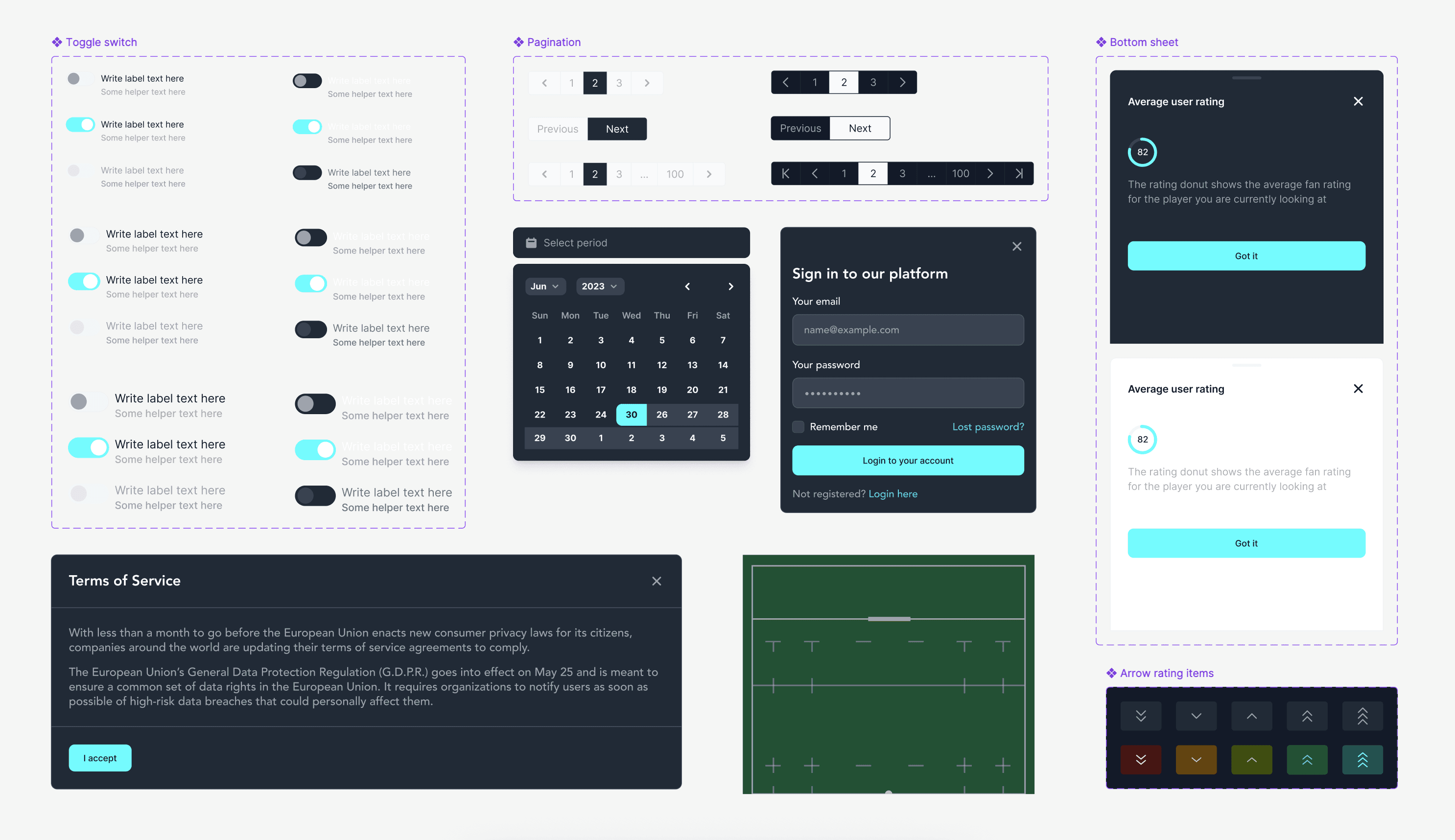
Taka had three products at the time, so I proposed a centralized design system with tailored themes and extensions for each. To move fast, I explored existing UI libraries that would align with our stack—since our engineers were already using Tailwind, I pitched Flowbite as a base system. After comparing a few libraries and sharing mockups, we chose Flowbite for its simplicity and breadth.
To extend it efficiently, I collaborated with an engineer to build a custom Figma plugin that would wrap each component in a stylable container without detaching properties—letting me theme it per product without detaching instances. This small technical workaround was a game-changer and let me scale design while keeping everything maintainable.
I led a team demo to explain the system’s structure and benefits. Getting devs excited was crucial—by showing how it would simplify their work and reduce maintenance overhead, we built real momentum. From there, I worked with a mid level designer, guiding them through the system so they could confidently contribute as it evolved.
One of my colleague's biggest concerns was that the design system would slow him down. The previous system included entire pages with pre-populated data, meant to act as templates—but instead, it resulted in a bloated library full of ultra-specific components. To rebuild his confidence and make the system easier to work with, I advocated to focus on building atoms and molecules rather than full templates. I showed him how to create truly reusable components—for example, designing one flexible input field that could work for name, birthday, or email, instead of creating a separate component for each.
Outcome
In just two months, I rebuilt Taka’s design system and applied it while designing a brand-new version of the app. By building and testing in parallel, we ensured the system was functional, scalable, and easy to adopt.
The results spoke for themselves:
Our engineers now work from a single, consistent UI library.
We reduced time spent on design handoffs and rework.
PMs were back on board with the design system—this time for good.
This work was so well received that I was invited to speak at a Friends of Figma event, where I demoed our process and shared insights on designing under pressure with limited resources.
Below is our app store banner

Below is a video of a couple pages from the Taka design system.
While most of my client reviews are NDA-protected (because, you know, top-secret agency white label stuff), I managed to sneak in a few favorites from my previous partners.